I created a brochure for my e-Communication program at school. I wanted to include a tiny graphic for all three strands in the program. In the center shows the e-Comm logo. The words that are close to the logo show the main aspect of each strand. Animation is shown by a bouncing ball, which was actually one of the projects I had this year. Video is represented by the camera, because that is the main tool that video students use. Web is represented by a computer because web designers put their websites on the web which people access mostly by computers. Graphic design is represented by a pencil and paintbrush because a large part of design is drawn and painted art, along with computer designed products. I believe this brochure will attract new students because this poster will catch their eye and the simplistic design will get the point across easily.
Translate
5/22/14
5/9/14
4/29/14
Grid Tutorial
This is my Digital Growth. I had to use the lightning effect and change some settings to make it "griddier". I would then take that section of "grid" and copy it, change the conductivity state (change what it looks like) and add it next to the previous section.
I would then set the growths off a little from each other and cause the motion of it moving left to right. I had adjustment layers on top to give it a colorization.
This is what I have so far. I used the grid effect to make multiple layers, and set the camera to have a depth of field so that farther and closer layers are blurry when others aren't. The "SHOK" has and effect called grid wipe.
These are my layers for the previous screenshot. There is an adjustment layer to add the blue colorization. some of the layers are offset to have all of the animations start at the same time.
These are the settings I used to create the grid effect. I made it "bouncey" to make the effect more "griddy" The decay is turned on to make it grow, and decay main core makes the overall glow decay. In expert settings I made if to where the effect was less complicated and to make it the most square possible.
The tutorial starts off with teaching you how to create the grid effect at first then tells you how to create the digital growth. Then it tells you how to make your word and give it a grid wipe effect and add it to a 3D comp. Then the tutorial teaches you how to turn the camera to finish off the project.
I used the lightning, grid wipe, and the colorization effects.
The hardest part was getting the digital growth to go left to right perfectly.
I enjoyed making the comp where the SHOK text is. It was cool how I could focus the camera on one part and the color I created was really cool. I think I can use this colorization effect in a later tutorial because it changes the color of everything and it is easy to get any color I want.
I felt the tutorial went fast in places and slow in others. The tutorial was overall easy to follow and the man explained everything he had done.
Here is the link to the tutorial:
WATCH HD
4/24/14
Personal Logo
I sketched some logos before making my artboard to get some ideas down before going into illustrator. I wrote what color I wanted some logos to be. I used this page as a guide when making my logos.
While designing my logo a created a grid of different logo designs. I used similar logos and gave them lots of variations to see which would look better.
4/11/14
Kern, don't Kem
In typography, kerning is the process of adjusting the spacing between characters in a proportional font, usually to achieve a visually pleasing result. Some fonts have letters that overlap each other like this:
I got an 85/100 which is very hard to obtain because you have to get the spacing almost perfect to get above a 60/100.
Others don't overlap like this font.
There is a kerning game at type.method.ac
It allows you to move the letters to find to right space between the letters for many different fonts.
I got an 85/100 which is very hard to obtain because you have to get the spacing almost perfect to get above a 60/100.
4/7/14
4/4/14
Google Logo
Sergey Brin created the first google logo in 1998. It was revised in 1999, so it became more similar to the one today.
In September 2013, the current logo was approved.
Google uses a transparent logo when a depressing event happens. Google will change that country's google webpage logo to transparent. The colors of the logos are symbols. The first 3 letters represent the primary color pallet in art, red, yellow, and blue. The last three are represented by the computer light color pallet, RGB.
Movie Poster
This is my minimalistic movie poster which is inspired from Saul Bass. I wanted to split the poster to show the conflict between the two characters on my poster. The red symbolizes that Darth Vader is evil and the blue symbolizes that Princess Leia is good. I also put in a quote from the point of the movie in which these characters meet.
Saul Bass made this poster. It is similar to mine because the colors and the minimalism of the character on the poster. We also have a quote from the movie in our posters.
3/31/14
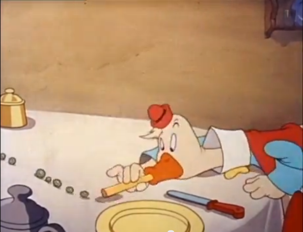
The Plausible Impossible
THE PLAUSIBLE IMPOSSIBLE
The Plausible Impossible has to do with the things in cartoons that happen that are impossible but are somewhat plausible.
In this scene, the plausible impossible is shown by the typewriter sound that is made when Gus Goose eats his corn. It is possible that you can eat the corn side to side as he does but it is impossible to make the typewriter sound.
In this scene, the plausible impossible is shown by how Gus Goose shoots the sandwich into his mouth like a deck of cards. This is plausible because you can eat a sandwich this way, but you cannot make a sandwich fly like a deck of cards, because they don't have the same composition.
Here, Gus Goose's neck makes an accordion sound. It is impossible because someones neck cannot make that sound, but it is plausible because the accordion looks like his neck in this scene, so it makes the sound.
In this scene, Gus Goose is using a straw to suck in some peas. This is impossible because you cannot suck in peas that are all the way across the table. This is plausible because you can suck peas through a straw.
3/14/14
Nerman Art Museun
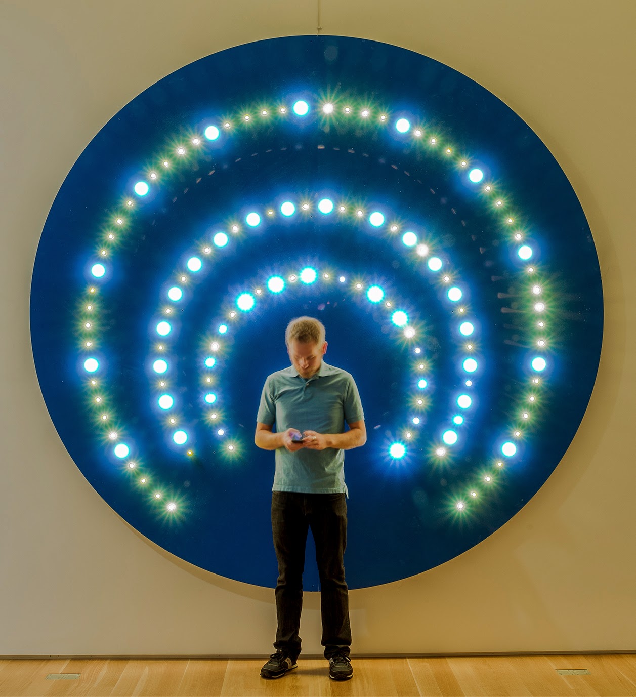
Dylan Mortimer- He graduated from the Kansas City Art Institute with a BFA and now lives in Kansas City after moving to New York to get a MFA. He shapes his artwork off of his religious beliefs. He created these works, showcased at the Nerman Museum of Contemporary Art, to resemble halos. He believes that going to heaven is not a right, but a choice, which is why he made these works. He uses blue, silver, and gold to depict the halos worn in old artwork.
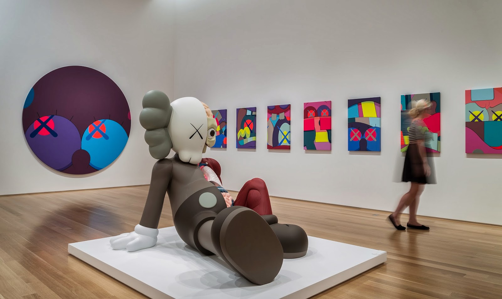
Brian Donnelly(KAWS)- He graduated from the School of Fine Arts in New York with a BFA. Donnelly's "Companion" is a rework that he created, of Mickey Mouse. His sculpture has been displayed all over the world including Paris, London, Berlin, and Tokyo and his sculpture has even been recreated into a float for the 2012 Macy's Thanksgiving Day Parade. He has also reworked the Michelin Man, The Simpsons, Spongebob Squarepants, and the Smurfs too. The Companion statue is on display at the Nerman Museum of Contemporary Art.
10 Things I Can't Live Without
My items reveal my personal story because I use most of the items every single day of my life. I play Xbox® every day with my friends, and it takes my mind away from the rough life as a teenager. My iPod 5 is also a center point in my life. I cannot think of one day that I haven't used it. It gives me access to all the social networking I need. Doing this project has taught me a lot about balance and using unused space.
Subscribe to:
Posts (Atom)